Eye For Film >> Movies >> London Symphony (2017) Film Review
London Symphony
Reviewed by: Andrew Robertson

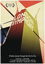
A crisp monochrome assemblage of moments through a day (of days) in the capital, London Symphony is transporting and at times transfixing. The heart of the film is in a series of contrasts, black and white and elements depicted.
It's in the ratios that the work both struggles and succeeds. In something that was probably 4:3 or thereabouts, it seems deliberately reminiscent of early cinema and the artistry inherent in, well, let's call it naive documentary, but this is something more. There are comparisons drawn that are powerful, political, provoking. A restaurant of glass and marble and polished metal that abounds with the bibulous and the iconography of Michelin's own advertising star Bibendum is followed by the processes of a food bank. Other sights are less constructed in the edit than by the eye - a sign that reads (approximately) 'FAST cheap GOOD PICK ONE (except cheap)' is amusing enough, but wider context adds a certain edge. The still striking Lloyds building (at time of writing Lloyds of London) mixes well with a tombola in Harrow, but there's a sense that the viewer is projecting as much as the mechanisms of cinema. I kept expecting the clipped tones of a Pathé announcer or a jaunty RADA-trained CBeebies voice to tell me about "busy people, busy places", and while that lack of a human connection can work there's something about the lack of a voice - any voice, even that of a narrator, or title-card, save music.

A silent piece - James McWilliam's score starts stringy in the morning and becomes bassier as the day unfolds, but there are more and subtler things going on within the structure. One moment with intersecting clocks is striking and arrays of urban elements are well presented to enhance and highlight certain forms of uniformity. A section within the Cinema Museum does shine light on its similarities to those early works of film, but it also highlights an issue that became apparent in the credits - there are several 'extra special thanks' and some of these resulted in logos of businesses presented in the only colour that appears within the film. I'm far from averse to the use of minimal colour - it's a technique used to completely different effect in Schindler's List and Chickens - but if you're the kind of person who watches credits it might be the kind of thing that discomfits. Co-operation from locations is certainly used to good effect, but as with product placement one starts to worry about artistic freedom.
Self-described as 'A Film In Four Movements', London Symphony is a film that put me in two minds. I'm still not sure about London Symphony and that's probably okay. It was crowd-funded, so it's clear that a couple of hundred people believed in it, and I don't think they were wrong to do so. My own experiences with crowdfunding suggest that the sign I referenced earlier might be overstating the options by three, and as a film London Symphony's understated nature means it might struggle on any wider menu. Those resident in the capital might enjoy some new perspectives, those who would be inclined to visit might enjoy the chance to find something to look for. This is a film in an older style whose production is very much of a newer style. Nitrate or not, its subject lends fertile visual ground, and though it unreels in pleasant style it's a harder sell amongst many screen options.
Reviewed on: 30 Jun 2017


