 |
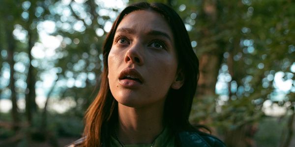
| Jessica Alexander in A Banquet |
The story of a mother, Holly (Sienna Guillory), who panics when one of her daughters, Betsey (Jessica Alexander) suddenly stops eating, but whose situation becomes still more disconcerting when the teenager doesn’t seem to be losing weight, A Banquet, which opens in the US on Friday 18 February and will soon be screening as part of the 2022 Glasgow Film Festival, marks the feature début of Ruth Paxton, an Edinburgh-based filmmaker whose work has been on our radar here at Eye For Film for some years. In fact, she tells me when we meet, we gave her her first ever professional review, for 2008’s surreal short She Wanted To Be Burnt. A Banquet is one of my personal favourites of the past year, and I ask her if her short film experience was useful in approaching it given that, structurally, it resembles a short, having an ostensibly simple plot with layers and layers of meaning.
“Definitely,” she says. “I was primed for this film. And I think that even though it's not a film I wrote, the tone of it and the themes within it were things I was very familiar with. I felt quite experienced expressing particularly, I guess, the idea of anxiety in the sense of this permeating dread. That's something that's present in most of my my short films. And the obvious connection between the shorts and the feature is that I was able to cooperate with the same director of photography [David Liddell]. So you know, that's a relationship that we've built for over a decade now, and a lot of the visual language that you see in A Banquet is the result of years of collaboration with each other, and honing our own brand of dark dread.”
That’s obviously a vital relationship in the creation of the film because there are several distinct visual styles involved, which speak to its ambiguities. Sometimes Betsey seems like a saint or a spiritual figure; sometimes we’re in horror territory; and sometimes the world seems quite mundane, snapping us back into a more conventional way of thinking.
“I think that's a really smart reading,” says Ruth. “We never wanted to specify any kind of particular religion with regards to what Betsey was around. Many versions of the script did suggest a religion, but I felt that I wanted it to be more ambiguous than, and so we changed that aspect of it. But there's no denying that I'm really influenced by Biblical and Classical art, and the kind of gravitas of like, pieta scenes and Madonna and Childs. I'm not a religious person, but I'm really into Catholic iconography. So that's something that I think is not only present in this film, and the way we frame Betsey, but it's also something that I just love in the composition of frames, so it's certainly there in previous work. But yes, you're right. We definitely frame Betsey up in such a way that she looks deific or like some kind of a saintly figure.
“I'm a big fan of negative space so there's a lot of shots that are very spacious, and, you know, frame up characters and corners, and allow for a lot of the room to be felt. And that's quite contrasting. And then I guess the third thing is the treatment of food in the extreme close ups. And that's just because that sort of stuff turns me on, like, textures. I'm always obsessed when I'm preparing for a film about how we can make it feel as real as possible, as well as look beautiful. How can we get in about the actual grit of it. It was the food gave us that opportunity in this film.”
It’s certainly not a film which I would advise anyone to watch when hungry and lacking supplies. The food with which Holly tries to tempt her daughter looks exquisite. Who created it?
“It's a talking point of this film, and it's all credit to Sofia Stocco, the production designer,” she says. “So we knew that Holly had a particularly keen eye for design and that she would be somebody that would prepare very specific foods. I didn't realise the possibilities for it on our budget. And I think that Sofia did an incredible job of preparing and designing a menu. She's a production designer, but she clearly can cook because she designed the menu and her and her team would put it together in a way that, just, we wanted to focus on it all the time. We took so much more footage of it than we even thought.
“She made really smart suggestions going into those places where I knew it's certain kinds of food, so like when Isabelle [Betsey’s sister] bites that chicken thigh, I knew I wanted something to drip in a blood-like way, but at the ice rink I had a similar beat with Holly eating something like that, maybe something that had coleslaw, something that would dribble. And it was Sofia that said, ‘Look, I get what we're trying to do with this, but we're on location that day, that would be a real nightmare for resets with costume. And could I suggest,’ says she, ‘I think she's the kind of woman that would have take-away sushi.’ And I love that, because it just tells us so much about who this woman is, and how she values foods. She's somebody that enjoys eating. And so yeah, I think that was a really, really smart decision. But yeah, it's all credit to her, it really is.”
Going back to negative space, visually, it struck me that a lot of what's going on in the film is also a sort of negative space around storytelling, and the way that there's so much that we don’t see or are not told...
“The heart of the film was, how do you harness this ambiguity, this sense of dread? I think that for me, personally, I'm someone who experiences anxiety, and in much of the short work I've made, a lot of that is about me trying to work out what that means, and kind of work out how to show an audience what being anxious feels like. And I think that the weight of dread, the weight of what anxiety is, which is basically nothing, it's the fear of nothing, it's the fear of something happening. That's very much what excited me about reading Justin’s script and the book, how you relate the idea of faith to that.
“Because I'm not religious, the idea of believing in something other than my reality is hard to tap into, except for when I realised that that's what's happening when I'm, you know, mentally unwell, as I'm believing things that aren't necessarily true. So, you know, that wasn't hard, I suppose that it comes with with me, and I don't feel like that was something that I had to prepare for. And certainly, you know, in collaborating with Dave, that's a theme in our work to date. So it felt like a natural progression.”
I also wanted to ask about the locations because there’s a marvellous dining room, but when it comes to the way the film uses woodland, it's a very neat suburban looking patch of woodland, and yet there's almost a bit of folk horror there. I wonder about her choice to use that, rather than using sort of more dramatic looking locations. It feels a bit like there's a an element of neatness and control that often goes along with eating disorders and the battle for control around those.
“That's also a very cool insight,” she says. “I think I wanted it to feel like a suburban setting because the idea is that she's wandered away from this party into a kind of a darker, I suppose, off the beaten track type woods. A lot of it was a decision from from the beginning to have this aesthetic. The control around it was very deliberate. We knew that we wanted to have a minimalist look to the house. I wanted the house itself to have a lot of personality, for sure, but I wanted it to feel like an uncomfortable place to be and yet still a family home. And so we went through a level of minimalism that at first I wasn't sure about. I was a bit leery of because it was super minimalist. But actually, you know, Sofia again pointed out that you don't see horror films that aren't cluttered.
“There's something with the horror house and the shadows and spider webs, you know, kind of what's going on in the pockets of darkness, but there's something slightly more alarming about how laid bare everything is in this house. And there was a certain amount of chaos that we introduced to the space as things progressed. It's something I wish we had learned into more but you know, It goes from being a very ordered space for them, to being like moments of violence within that space and things being not as neat, slightly off kilter as things progressed. And obviously there's a certain amount of mess that accumulates around Holly too.”
A Banquet opens in the US on Friday 18 February and in the UK on Friday 8 April.


